


In today's competitive marketplace, creating a sign that commands attention is essential for capturing foot traffic, building brand recognition, and conveying critical messages in seconds. Whether designing an exterior storefront display or an interior directional plaque, every structural choice influences customer perception. Achieving commercial success requires a balance of aesthetic appeal, engineered durability, and strategic placement. To navigate these variables, business owners frequently turn to local sign printing companies to translate concepts into powerful real-world displays. Mastering key design fundamentals enables organizations to transform basic markers into compelling, high-converting visual assets.
Choosing Legible Typography and Balanced Typefaces
Typography serves as the functional foundation of effective visual communication. When prospective customers pass a storefront or highway display, they often have only two to three seconds to register the message. High legibility ensures that words remain decipherable at a glance from varied distances. Font weight, kerning, and spacing must remain proportional so characters do not blur together under sunlight or artificial lighting. Experienced local sign printing companies often recommend pairing an authoritative header font with a clean secondary typeface. This visual hierarchy guides the viewer's eye through business names and contact details, anchoring brand identity and fostering consumer trust.
Harnessing Color Psychology and Emotional Resonance
Color choices trigger immediate cognitive associations and psychological reactions before a viewer reads a single word. In commercial signage, tailored palettes establish atmosphere and guide consumer behavior. For instance, rich blue tones evoke dependability, security, and corporate stability, making them a standard for financial institutions and healthcare providers. Conversely, vibrant red hues stimulate urgency and energy, explaining their popularity among retail promotions and food establishments. Professional design specialists help organizations evaluate how target demographics respond to specific color combinations. Aligning signage hues with established brand assets ensures visual unity across customer touchpoints, transforming fleeting glances into lasting impressions.
Applying High Contrast and Clean Color Separation
Even the most thoughtfully selected color scheme will fail if visual contrast between lettering and the background is inadequate. High contrast guarantees that text remains distinct, especially for moving motorists or pedestrians navigating busy corridors. Dark typography over a bright background—or crisp white lettering against a dark base—minimizes visual strain and retains legibility across shifting daylight. When organizations partner with local sign printing companies, print technicians utilize precise contrast charts to verify legibility across various viewing environments. Applying vibrant accent colors to key focal elements, such as contact numbers or special offers, directs viewer attention where it creates the greatest impact.
Selecting Weatherproof Materials and Resilient Substrates
The physical substrate of a sign dictates not only its visual prestige but also its longevity and resistance to environmental wear. According to Mordor Intelligence, outdoor signage represented 62.34% of printed signage installations by application in 2025. With outdoor displays commanding such a substantial portion of the industry, selecting durable materials is crucial for protecting an advertising investment against premature breakdown. Substrates such as heavy-gauge aluminum, acrylic, high-density urethane, and UV-resistant vinyl withstand solar radiation, moisture, and wind without warping or fading. Knowledgeable local sign printing companies guide organizations toward resilient substrates that balance upfront costs with multi-year durability, keeping commercial displays pristine through every season.
Incorporating Tactile Textures and Dimensional Lettering
Flat, two-dimensional signs frequently get lost within visually saturated environments, whereas dimensional lettering and textured surfaces naturally capture visual attention. Adding raised acrylic letters, brushed metal finishes, routed wood, or alternating laminates introduces rich tactile depth to an installation. These dimensional surfaces interact dynamically with sunlight and ambient fixtures, casting organic shadows that change throughout the day. Premium architectural finishes convey permanence, craftsmanship, and credibility that elevate brand perception. By consulting with creative local sign printing companies, businesses can explore precision routing and fabrication techniques that transform standard wall plaques into striking sculptural centerpieces.
Installing Strategic Illumination and Energy-Efficient Lighting
A sign's marketing value should never disappear when daylight fades, making illumination one of the most critical considerations in modern sign fabrication. Well-planned lighting ensures continuous visibility while improving legibility during rain, fog, or evening hours. Modern LED systems offer superior energy efficiency, minimal operating overhead, and thousands of hours of reliable illumination compared to vintage fluorescent fixtures. Options such as face-lit channel letters, halo backlighting, and external spotlights provide versatile aesthetics matching any brand identity. For off-grid installations, solar-powered lighting components provide an eco-conscious alternative that lowers utility expenses while producing a balanced glow that welcomes evening clientele.
Integrating Cohesive Graphics and Professional Imagery
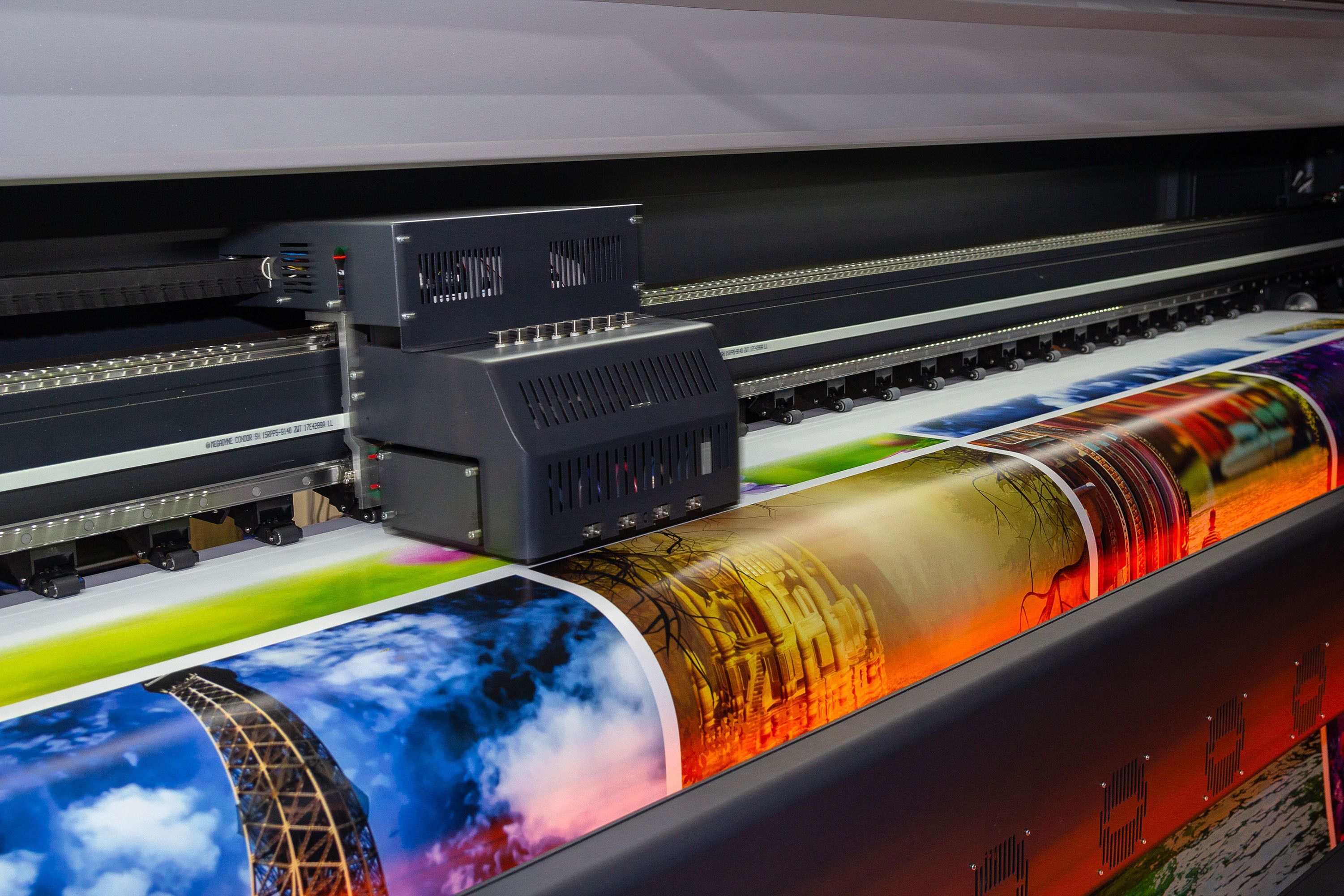
Visual icons, logos, and high-resolution graphic elements allow signage to convey complex ideas in a fraction of a second. A well-designed corporate emblem or universal directional graphic transcends language barriers, guiding visitors intuitively through parking structures, medical campuses, and shopping centers. However, graphical elements must be integrated with disciplined restraint; overcrowding a sign face with excessive imagery dilutes the central marketing message. Leading local sign printing companies deploy advanced wide-format printers and color-matching calibration systems to ensure vector artwork and photographic imagery reproduce with flawless sharpness. Preserving graphic consistency across building signs, banners, and vehicle graphics establishes immediate brand recall throughout the community.
Embracing Sustainable Substrates and Eco-Friendly Practices
As corporate social responsibility increasingly shapes consumer preferences, adopting environmentally friendly signage practices has become a powerful competitive differentiator. Utilizing recyclable aluminum, biodegradable composite panels, low-VOC printing inks, and post-consumer plastics demonstrates an authentic commitment to sustainability. Eco-conscious manufacturing processes appeal to modern consumers without sacrificing elegance or structural durability. Advanced green materials often provide lightweight handling, reducing transportation emissions and simplifying on-site installation procedures. Forward-thinking enterprises continually embrace sustainable substrates and energy-saving production techniques, minimizing environmental footprints while projecting a progressive brand image.
Optimizing Physical Placement and Direct Sightlines
Even the most strikingly designed sign will underperform if it is obstructed by overgrown landscaping, parked vehicles, or competing architectural elements. Strategic placement requires evaluating the surrounding environment from the vantage points of walking pedestrians and passing motorists. Signs must be mounted at an appropriate elevation and angled perpendicular to dominant traffic corridors to ensure uninterrupted sightlines. Determining proper sign scale involves calculating viewing distances and average travel speeds, allowing motorists sufficient reaction time to absorb the message safely. Comprehensive on-site surveys conducted by local sign printing companies verify that mounting heights, setbacks, and surrounding environmental features work in harmony to deliver maximum visibility.
Navigating Municipal Regulations and Local Zoning Codes
Before any commercial display moves into fabrication, it must satisfy municipal zoning ordinances, structural building codes, and safety mandates. Municipal guidelines frequently regulate overall sign dimensions, structural height limits, property setbacks, and illumination brightness to preserve neighborhood character and prevent driver distraction. Failing to adhere to these statutory standards can result in severe financial penalties, permit denials, or mandatory sign removal. Experienced local sign printing companies possess extensive knowledge of municipal permitting processes, engineering guidelines, and historic district restrictions. Entrusting regulatory compliance to knowledgeable signage professionals ensures your project progresses smoothly through approval stages without unexpected expenses or project delays.
A standout sign represents more than temporary advertising; it operates as a continuous brand ambassador, building market presence, guiding customers, and reinforcing company credibility. By integrating legible typography, thoughtful color psychology, high visual contrast, resilient materials, dynamic illumination, and compliant placement, businesses can create signage that rises above visual clutter. Premium materials and disciplined design choices ensure your physical branding generates meaningful community recognition and ongoing commercial growth. For business owners ready to elevate their storefront presence and turn everyday passersby into dedicated clients, contact ASAP Printing today to create custom, professional signage that makes your brand truly memorable.


